Designing a testimonial wall that matches your book's brand
You agonized over your cover. Your website matches it. Then the review widget shows up in someone else's font and someone else's shade of blue. Here's how a few small choices — colors, type, and layout — make reader reviews look like part of your book's world instead of a bolted-on box.
Start with your cover, not a color picker
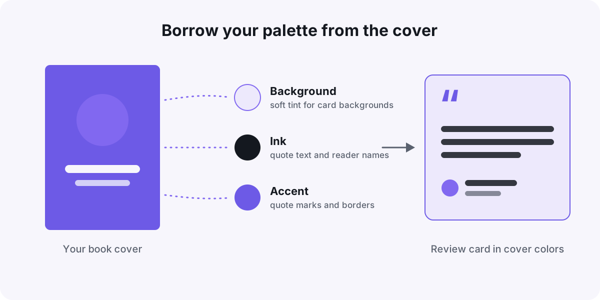
Your book cover is already a brand system. It has a palette, a mood, and lettering readers recognize the moment they land on your site. So don't invent new colors for your testimonial wall — borrow them.
Open your cover image and use an eyedropper tool (most design apps and browsers have one built in) to sample three colors:
- A background — usually the cover's dominant tone, softened to a light tint so text stays readable.
- An ink — the darkest color on the cover, for quote text and reader names.
- An accent — one bold color for quote marks, borders, or links. One is enough.
Full-strength cover colors can overwhelm a wall of twelve cards. If your cover is deep burgundy, try a pale tint of it as the card background and save the full burgundy for small accents.
Two fonts is plenty
A safe rule: use your site's heading font for the section title ("What readers are saying") and your site's body font for the quotes themselves. That alone makes most widgets feel native.
If your cover uses a decorative typeface — a swirly script, a distressed slab — resist putting review text in it. Display fonts are built for five words, not fifty. Let the section heading carry the personality and keep the quotes plain.
Genre can guide you. A thriller carries sharp, condensed type well; a cozy romance suits a warm serif. When in doubt, plain wins — the reviews are the star, not the lettering.
Pick a layout that fits how many reviews you have
There's no single right layout. The honest question is how many strong reviews you have today.
- Grid wall — best with nine or more reviews, especially a mix of video clips and text quotes. It feels abundant, like a full shelf.
- Carousel — best with three to eight strong reviews and limited page space, for example right under your buy buttons.
- Single spotlight — one standout video review, full width, near the top of the page. Quality over quantity.
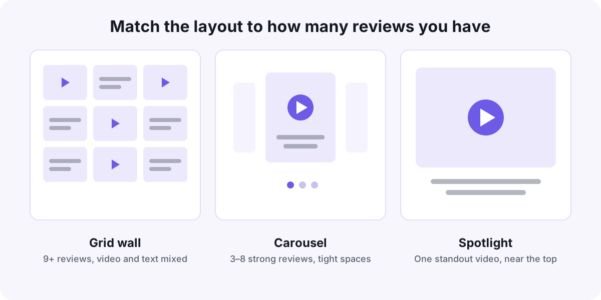
If you're mixing video and text, alternate them so the wall has rhythm instead of clumps. And placement matters as much as styling — this guide to where to embed testimonials on a sales page was written for course creators, but the placement logic applies just as well to a book page.
Small details that sell it
Once colors, fonts, and layout are set, a few finishing touches close the gap between "widget" and "part of the site":
- Match corner rounding to your site. Sharp buttons, sharp cards. Pill-shaped buttons, rounded cards.
- Use your accent for quote marks and borders. Stars can stay a familiar gold — readers scan for them.
- Trim quotes to a consistent length. Two to four sentences per card reads best; an ellipsis is fine as long as you keep the reviewer's meaning.
- Drop the default shadow if your site is flat. Nothing says "embedded widget" louder than one floating white box.
- Caption your videos. Auto-captions keep the wall working for visitors browsing on mute — and many are.
A ten-minute pre-publish check
Before you ship it, run this quick pass:
- Squint test. Scroll the page with your eyes half-closed. Does the wall blend in, or does one block jump out in the wrong color?
- Phone test. Cards should stack into one column, and quote text should be readable without zooming.
- Sibling test. Put the wall next to your cover image. Do they look like they came from the same designer?
- Read the quotes out loud. Keep reviews that mention something specific — a character, a chapter, a feeling. A simple tagging system for your testimonial library makes surfacing those much faster.
If your shelf is still mostly empty, that's fixable. Start with how to ask for a video testimonial in a way that actually gets one, and pull in the reviews you already have — Wovestory imports from Amazon, Goodreads, and 30+ other platforms — while new clips come in.
None of this needs a designer or a redesign. Sample three colors, pick two fonts, choose one layout, and spend ten minutes on details. Your readers wrote you something wonderful — give it a frame that looks like it belongs on your shelf.
Put your customers on camera
Collect, caption, and embed video testimonials with Wovestory — see it on your own testimonials in a 20-minute call.