Where to embed testimonials on a course sales page
The same student clip can carry a sale or get scrolled straight past — the difference is where it sits on the page. Here are the three placements that earn their spot, and a simple way to test them on your own sales page.
Put proof where the doubt is
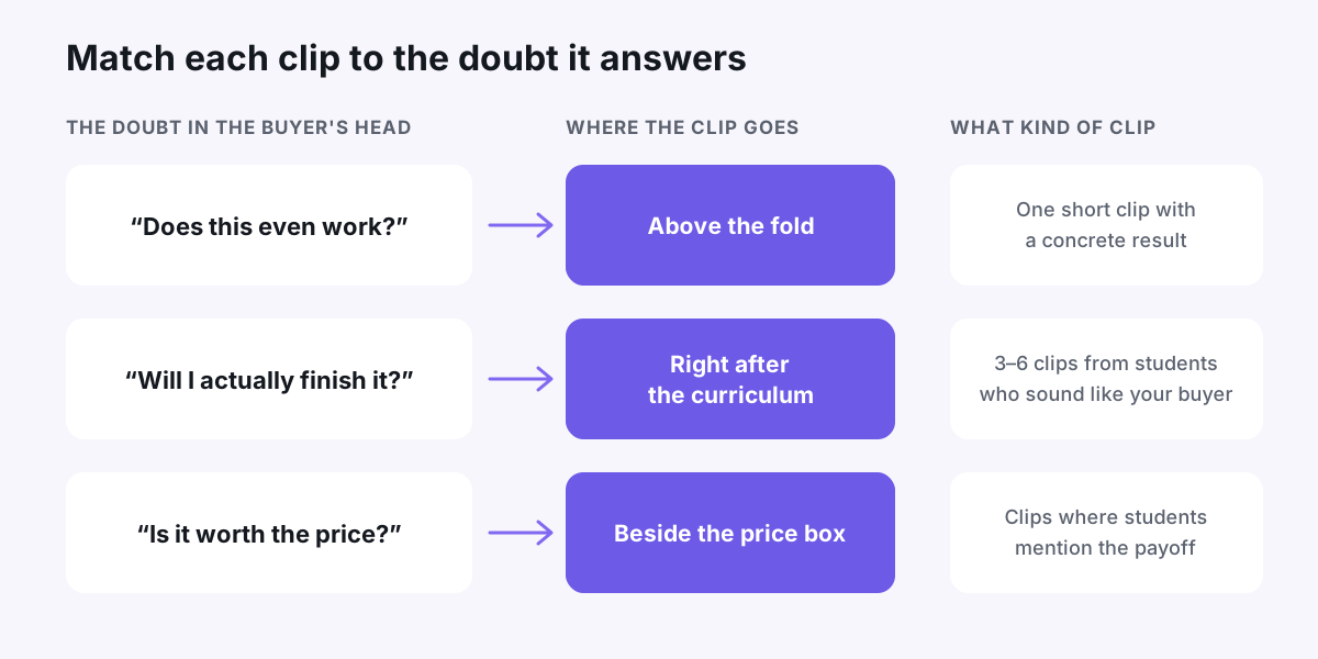
Nobody reads a sales page top to bottom. Buyers skim until something makes them hesitate, and each section of your page triggers its own hesitation. The headline raises "does this actually work?" The curriculum raises "could I keep up with all this?" The price box raises "is it worth that much to me?"
A testimonial works hardest when it sits right next to the doubt it answers. Twenty clips dumped at the bottom of the page answer nothing in particular, because a hesitant buyer usually leaves before reaching them.
So the first job isn't placement at all — it's sorting. Go through your clips and label each one by the doubt it answers: results, time and difficulty, or value for money. If your clips live in one messy folder, a simple system for tagging and sorting your testimonial library turns this into a ten-minute job.
Above the fold: one clip, not a wall
The area before a visitor scrolls has one job: make them believe your headline is real. One clip does that better than ten, because ten clips become wallpaper.
Pick your strongest result clip — a student saying, in their own words, what changed for them after the course. Place it beside or just under the headline, small enough that your pitch still leads.
Three rules for this spot:
- Click-to-play only. Autoplaying audio is the fastest way to lose a visitor.
- Caption it. Plenty of people browse on mute, and a captioned thumbnail still communicates even when nobody presses play.
- Add one line of context under the clip, like "[Name] finished the course while working full-time." It tells skimmers what they'd hear.
Resist the urge to put a full testimonial wall up here. It pushes your actual pitch — what the course is and who it's for — below the fold.
After the curriculum: proof that people finish
A detailed curriculum is impressive and intimidating at the same time. After scanning twelve modules of content, the question in a buyer's head is rarely "is this good?" It's "will I actually get through it?"
That makes the spot right after the curriculum ideal for a small wall of clips: three to six students who sound like your buyer. Busy parents, career switchers, self-described "not tech people." The message isn't "this course is great" — it's "people like you finished this, and it paid off."
This is the placement we build the whole play around in our walkthrough of how a course creator doubled enrollments with a Wall of Love — the wall sits exactly here: after the curriculum, before the price.
Beside the price: answer "is it worth it?"
The price box is where most visitors quietly leave. It's also the easiest place to help them stay: one or two clips from students who talk about what the course was worth to them — a first client, a raise, hours saved every week.
Video can crowd a pricing layout, so a short text quote with a name and photo works well here too. Pull the strongest sentence from a clip and link it to the full video, so anyone who doubts the quote can watch the person say it.
One honesty rule that protects you long-term: only use payoff claims your students actually made, in their own words. Don't round up, and don't imply their result is typical.
How to test placement on your own page
You don't need a testing platform to learn what works on your page. You need patience and a note-taking habit.
- Get a baseline. Write down two to four weeks of numbers before changing anything: sales page visits, checkout starts, enrollments.
- Change one placement at a time. Add the hero clip, or move the wall — never both at once, or you won't know which change did what.
- Run each change for at least two weeks. A weekend of data mostly measures the weekend.
- Read direction, not decimals. With a few hundred visitors a week, small swings are noise. Act on shifts that are large and hold up for the full test.
If your page builder has a real A/B testing feature, spend it on your biggest question — usually "wall after the curriculum vs. wall beside pricing." And if you have a scroll map tool, look for the point where most visitors stop scrolling. A clip placed just before that drop-off often keeps more people moving.
A starting layout you can ship today
If you'd rather start from a sensible default and test from there, use this:
- One captioned result clip above the fold, click-to-play.
- Three to six clips from relatable students right after the curriculum.
- One or two payoff-focused quotes or clips beside the price box.
- One reassuring clip near the guarantee or final enroll button.
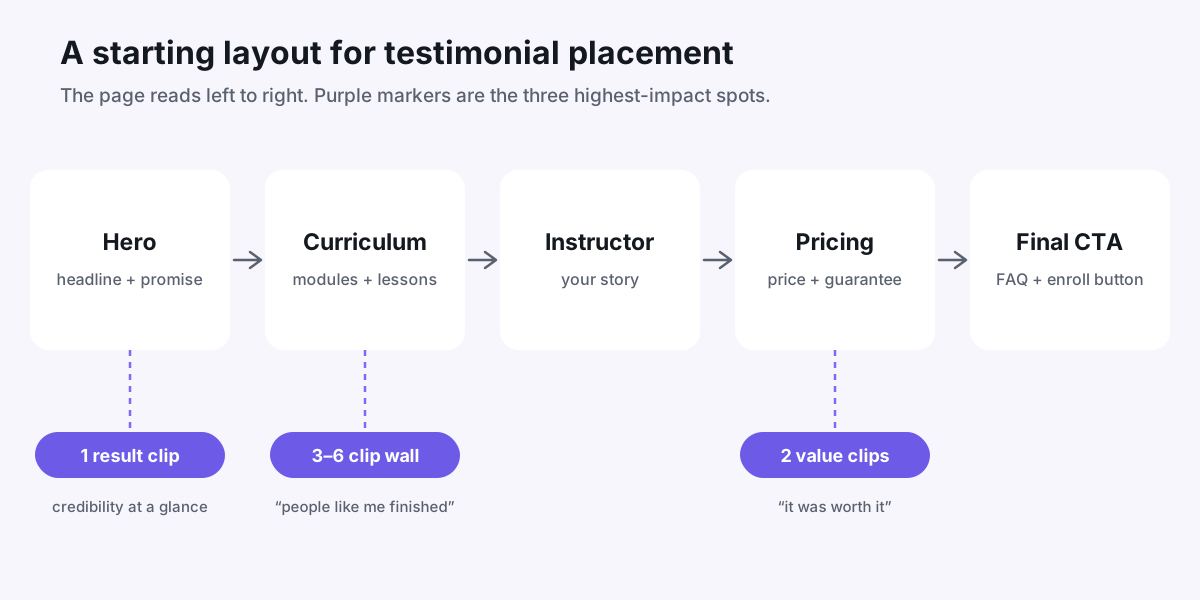
That's four placements, and six to ten good clips fill all of them. If you don't have that many yet, start with the hero and pricing spots, then use our guide on how to ask for a video testimonial to fill the rest. From there, let your own numbers — not anyone's best practices, including ours — decide what stays.
Put your customers on camera
Collect, caption, and embed video testimonials with Wovestory — see it on your own testimonials in a 20-minute call.